Many of us look to prestigious institutions like TIME Magazine for societal and cultural commentary. The magazine chooses their “Time’s Person of Year” every December, but publishes cutting-edge material all year round.
The magazine covers trending topics, mostly surrounding political and economic subjects, and their articles have always been known for their incisive takes. From time to time though, the images gracing their covers have stirred up more attention than the editorial behind them.
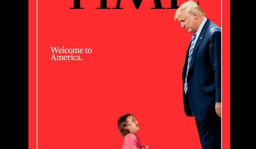
A few, including last week’s cover of Donald Trump looking down at a migrant child, will go down in history as some as the most memorable of all time. Though the magazine has been in print since 1923, here are the three best covers of the last 18 years.
1. “Welcome to America”
The “Welcome to America” cover was released on June 21 and immediately created an uproar amongst politicians and citizens fighting the Family Separation Policy. It depicts a young Honduran child crying while gazing up toward President Trump with the caption “Welcome to America” above them.

The image brewed controversy for more than one reason, but primarily because it reveals the harsh reality for immigrant children on the southern border.
Attorney General Jeff Sessions announced the zero tolerance immigration policy on people crossing the U.S.-Mexico border in April. As stated in the policy, children of all ages will be separated from their parents and placed into holding facilities while their parents remain in jail.
Three days after the cover’s release, news outlets and fact-checkers discovered that the toddler depicted was not, in fact, separated from her mother and placed in a holding facility. The original image shows the child’s mother detained by police, but the two were never separated.
People with motives to prove mainstream media’s contribution to fake news rang the alarm when the true story behind the child was brought to light. When contentious issues, such as immigration, grace headlines, images and stories twist to fit narratives perpetuated by both sides of the aisle.
Some call the toddler a symbol for the greater issue of a mass migration rather than an example of the separation policy, while others argue the cover is inaccurate and drives a false story meant to be believed by readers.
TIME published a “behind the cover” explanation of the photographer and photo. John Moore is the Pulitzer Prize winning photographer working for Getty Images who snapped the infamous photo in McAllen, Texas. The issue hits stores and newsstands on July 2.
2. “Are You Mom Enough?”
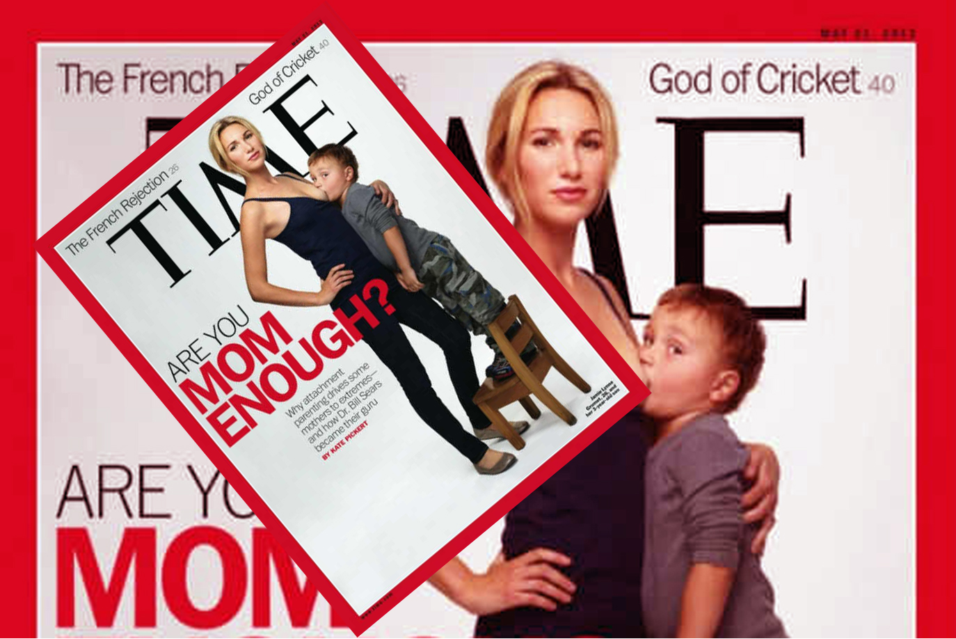
Jamie Lynne Grumet and her 3-year-old son, Aram, posed for the May 2012 cover as the face attachment parenting. The cover also struck up discussions due to societal expectations placed upon breastfeeding mothers.

The controversy from the TIME Magazine cover stems from the age of Grumet’s son, who was far beyond the typical breastfeeding age for most children. The American Academy of Pediatrics recommends mothers breastfeed continuously until 6 months and with food until a year old.
A door for women who practice extended breastfeeding, aka breastfeeding children between 12 and 24 months, opened when the cover was released. The cover’s audience grew as Grumet appeared on talk shows like the “Today” show.
Many people reacted negatively to the image because of the child’s age, though there are beneficial health factors to continued breastfeeding. The Mayo Clinic cites balanced nutrition, boosted immunity and improved health for children and mothers choosing to breastfeed beyond infancy.
Attachment parenting, as mentioned in the subtitle, is a style of parenting that “encourages responsiveness to children’s emotional needs, enabling children to develop trust that their needs will be met,” according to Attachment Parenting International. They also encourage techniques relating to breastfeeding.
The Atlantic published a piece on the perils of this parenting style, such as codependency and cosleeping. Codependency can stem from the style’s proposal of soothing with breastfeeding, but also excludes other caregivers as it can only be administered by a mother. Cosleeping creates a dangerous environment for babies, as suffocation by parents can occur by rolling over in their sleep.
The cover fueled another topic: public breastfeeding. Critics of the practice see it as inappropriate or sometimes even indecent exposure, which is a misdemeanor. All states, excluding Idaho, have passed laws protecting mothers and allowing them to breastfeed wherever they deem necessary. TIME also published a “behind the cover” explanation of the motivation, photographer and photo.
3. “Tragedy in Boston”
The “Tragedy in Boston” May 2013 cover took the world by storm with a striking image of a wounded child from the second blast at the Boston Marathon.

A terrorist attack enacted by two brothers, now known as the “Boston Bombing,” rocked the Boston Marathon’s finish line in April 2013, killing three people and wounding over 200. The majority of injuries were caused by shrapnel in pressure cooker bombs.
The controversy in the TIME Magazine piece lies in ethical journalism. The heartbreaking image broadcasted the ethical lines editors and reporters must decide to cross or not cross in order to accurately portray stories.
Discussions on whether or not a bloody child was absolutely necessary to the storytelling undoubtedly circulated in TIME’s newsroom.
The role of journalists is to tell a true and unbiased story to the best of their ability, not censor reporting to protect the public from harsh realities. Reporters are the public’s watchdog and therefore their duty to show the images no one wants to see.
A “behind the cover” published by TIME Magazine tells of the freelance photographer, Bill Hoenk, and his journey in capturing this critical moment. He explains how he saw a police officer lift the child and yell for everyone to leave in fear of a third explosion.
Michael Mrak, Design Director for Scientific American, commented on the magazine’s use of the image, “The Time cover is particularly gruesome as it shows two real tragedies, that children were involved (again on the world stage) and the unnecessary death and wounding of so many people.”
Mrak also commented on how long and hard the TIME team thought about whether or not to use it. Fellow journalists understand the struggle his cohort’s reporting must go through.
Many other news outlets and magazines caught flak for their reporting of the “Boston Bombing,” including Rolling Stone who had the face of one of the brothers on the cover. Rolling Stone was accused of glamorizing terrorism and the exploitation of circumstances for profit. Many claims like these spiral around journalist institutions in the light of tragedy.
TIME Magazine has a responsibility to its readers to inform them as accurately as possible while still remaining an edgy institution handing out highly sought after titles. The controversies hidden within covers fails to compare to the long and interesting past of the publication, such as naming Adolf Hitler “Man of 1938” due to his work in unifying Austria and Sudetenland.
TIME continues to amaze the masses for their choices of images and crowning influential people.


