Sometimes, people ask me, “Where can I find your poetry?”
I usually tell them, “My Instagram,” but truthfully the few poems I do have posted there are hidden among selfies and filtered pictures of sushi.
Recently, I’ve been thinking about keeping a portfolio of my work online, so everything’s in the same place and easy to find. Just the other day, I had an epiphany: I should create my own website.
With my own website, I can track where my work’s been published, post videos of myself from different poetry readings and explain who I am in a succinct and interesting way.
In addition, I can send the link to whoever I want whenever I want—anyone who wants to read more of my poetry or book me for a reading can do so with ease. Also, considering I’ll soon be a college graduate, and I’m hoping to publish my first chapbook in the near future, I’d like to have something more professional than my Twitter to show other people.
A website focused strictly on my career goals and creative endeavors makes perfect sense. And besides, a website can be a incredibly powerful tool for not just for personal branding, but even building a business and creating streams of passive income.
So, upon figuring out what I wanted to do, I immediately started wondering, “Where the hell do I start?” Although I don’t currently have a finished website up and running, I’ve been doing a lot of research since immersing myself in the process of creating one. I’ve learned a lot in a short amount of time, and so here are some tips I have for anyone trying to build their own website.

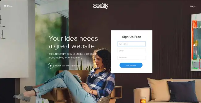
First, you don’t have to be a master coder to create a website — there are plenty of website builders out there to choose from. A few of the more popular ones include: Wix, Weebly, Squarespace, WordPress and Jimdo. Before you decide which one best fits your website needs, one thing to think about is payment.
In reference to the website builders above, each of their premium plans are different. Sometimes certain layout designs and templates are free, while others are not. Pricing varies: You may end up deciding to pay monthly if you want more than what “basic use” can give you.
For example, with Weebly, you can pay $8 a month and get a domain name without the word “Weebly” in it, as well as unlimited storage. Ask yourself what you really want out of your website, and how much you’re willing to pay (if anything) before you make a decision.
Besides, website builders, you’ve also got the option to go for another popular option: WordPress. This is essentially a free piece of software that is the foundation of about 30 percent of websites on the internet — the only requirement you’ll need is a hosting account to set up your site (typically between $2 to $8 per month).
There are literally hundreds of web-hosting companies around, but I recommend that you opt for one of the more reputable firms out there for more peace of mind. You might want to read a comparison of popular companies, such as InMotion vs SiteGround, on articles such as this one on CollectiveRay.com. Alternatively, you can also go on a research spree for whichever web hosting provider suits your needs the most by taking into account which features you need & how much of those features are a viable option for you.”
Another thing to think about before choosing a website builder is layout design. Depending upon the purpose of your website, your layout design should reflect who you are as an artist or professional; it should also be visually appealing, as well as easy to navigate; a helpful tool like Crello could make your website pop. A person won’t spend more than 59 seconds looking at a dull website, and no one should have to search through numerous tabs to find your work.
When someone clicks on your website link, they shouldn’t be brought to a confusing page. Instead, they should be exposed to some of your best work. You don’t want them asking themselves, “What is this?” Instead, you want them to think, “Where to next?” as they explore what you’ve created.
Important to note: color choice matters. In my Public Relations course last semester, we examined (as a class) different websites, and discussed what we liked about each of them. Personally, the website for “The Truth” campaign caught my attention because of the bold fonts and bright colors. Successful color combinations can strengthen the connection between your website and any person clicking through it.
Maybe you’re thinking, “What should I include on my website?” I would start with an “About Me” section, pictures of yourself so people know what you look like, an original logo and possibly an updated resume.
An “About Me” section is important because it gives you a chance to provide some insight, and answer the question, “Why should anyone care about my website?”
When writing a cover letter, I only include what’s relevant: I write where my poems have been published, what I’m studying in school, where I’m from and so on. I think the same applies with an “About Me” section: you want to put your best foot forward, and you definitely don’t want to lose people before they read or view any of your work.
Referring back to providing insight, you want to captivate and inspire people with your words. For instance, I could write, “Bri Griffith is a writer,” or I could write, “Bri Griffith is a poet from Pittsburgh, Pennsylvania whose work tends to focus on the human body and its many forms.”

When it comes to including pictures on your website, make sure they’re high quality. First, if you’re a photography student or freelance photographer, you don’t want to upload blurry photos to your site. If you’re an artist or graphic designer, low quality pictures won’t put your work in the best light.
To any musicians, writers or poets creating websites, professional photos go a long way. Look for the photography students on your campus, get in contact with them and collaborate. Of course high-quality images look nice, but professional photos will also help you establish a sense of credibility.
In addition to professional photos, you may want to add an original logo to your site to enhance creativity. Websites like Canva and Venngage provide users with free templates and design elements to create rad infographics and headers.
Another option is to seek out the help of a graphic design student on your campus, especially considering their homework may involve creating custom logos. For example, a year ago I created a blog, and asked a friend of mine to draw for me an original logo. She pulled through, and I felt good knowing no one else on the internet had what I had.
Lastly, including a resume on your website is smart because you’ll never again have to search through hundreds of word documents to find it. Also, future employers may stumble across your website, and having an easily downloadable resume on deck may increase your chances of landing a new job.
Note: if you’re interested, you can use Google Analytics to track how often people are on your site, for how long and when your site gets the most visitors. Also, Google Analytics will know whether or not one person visits your site often, or if multiple people show up at the same time. The data you receive will come in handy if and when you decide to redesign or upgrade your website.


[…] what they are looking for right away, their next thought will be to look for a search field. Put web design perth australia and include a search […]