Think of your website’s homepage as your business’s virtual storefront. It’s likely going to be the first thing that many website visitors see when they come to learn more about what you do — this means that you need to put a lot of effort into getting it right!
Having a great homepage can help you build trust with website visitors, capture more leads, give a great first impression of your company, and generally earn more sales. In this article, we’re going to outline how you can create a great homepage.
Let’s get started!
Use your homepage to show off positive social proof
Social proof is one of the most effective tools for showing your website visitors that you’re great at what you do and build trust. When designing your website, you need to include social proof! Here are just a few different ways you can display social proof on your homepage:
- Showcase testimonials from past clients or customers
- Highlight 5-star reviews and ratings you’ve received
- Show off different media mentions you’ve received
- Display your awards or relevant qualifications
Let’s take a look at a few websites that do a good job of displaying social proof for inspiration.

Arielle Executive, a branding and resume writing service for executives, showcases their social proof in a few different ways on their homepage. Firstly, they showcase their 5-star Google rating — this is very impressive, as they have more than 100 reviews! Secondly, they point out that they’ve received media mentions from several well-known publications, including Financial Review, Forbes and the BBC. These two elements together are great for building trust among website visitors. So, people who see this social proof will be more likely to spend money with Arielle Executive in the future!
For your own website, consider using a similar strategy. Social proof should be one of the first things that a website visitor sees. On your homepage, add elements like Google ratings and media mentions, as Arielle Executive has, in order to build trust with your website visitors and make more sales.
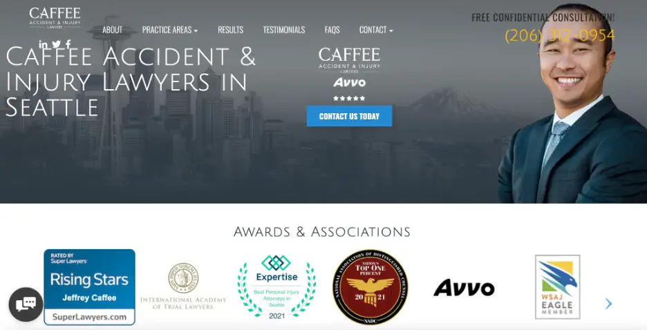
Caffee Accident & Injury Lawyers, a personal injury law firm in Seattle, has also highlighted their social proof above the fold. However, instead of showing their media mentions, they display some of their most impressive industry awards. These show that Caffee Accident & Injury Lawyers are very respected in their field, boosting trust with the website visitor and making it more likely that they will want to hire this firm.
On your homepage, display your awards! And if you don’t have any, don’t worry — Awards Finder is a great tool that will help you discover industry awards that you can apply for. Once you’re nominated or have won, display these badges on your website in order to build trust with your website visitors.
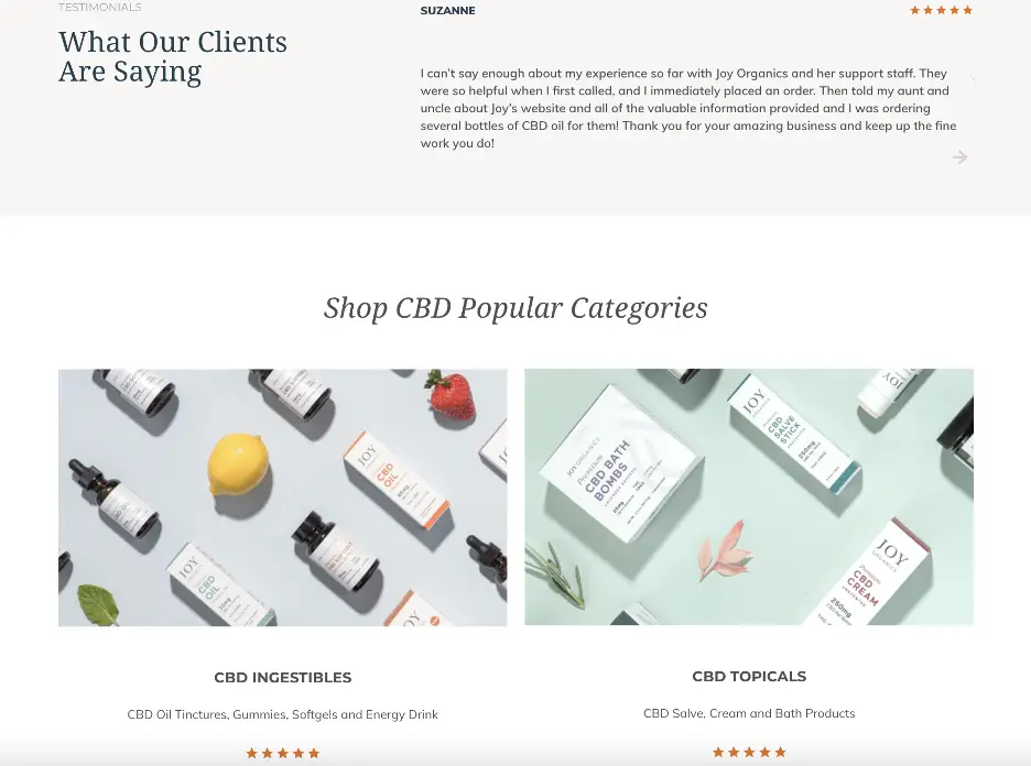
Finally, Joy Organics, a retailer of CBD products, uses reviews and testimonials as social proof on their homepage. As you can see in the image above, Joy Organics uses both long-form testimonials and star ratings to showcase their products’ quality for website visitors. As a result, not only can shoppers quickly compare their products, but they can also get an idea of what the customer experience is like with Joy Organics. This makes them a very effective form of social proof.
On your website, don’t be afraid to use different types of reviews to show how great your products are. Having a variety of reviews on your homepage will show customers that you’re great at what you do, so they’ll make a purchase with you!
Ensure it’s very easy for people to take the next step
When people land on your homepage, you want to make it as easy as possible for them to take the next step with your business. This will increase your chances of making a sale. There are a lot of different ways you can make this process more efficient for your website visitors. Here are a few suggestions:
- Offer a clear call to action (CTA)
- Provide a sophisticated search feature that can direct the user to what they’re looking for
- Make it easy for the website visitor to get in touch with you
Doing this will help your website visitors move forward in the buying process. Let’s take a look at a few businesses that use this tactic well for inspiration.
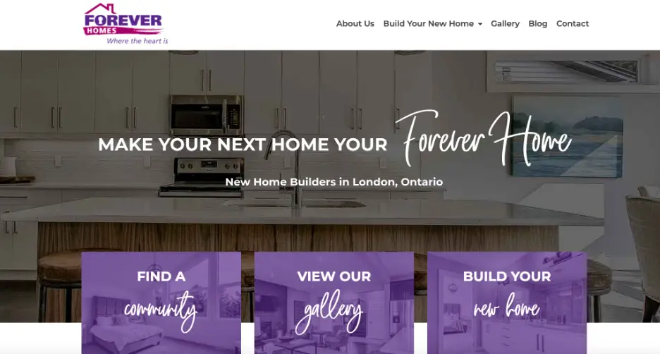
Forever Homes, a real estate company in London, makes it very easy for website visitors to take the next step on their homepage. As you can see in the image above, there are three CTAs in the purple boxes: “find a community,” “view our gallery” and “build your home”. No matter where the visitor is in their buying journey, there is a button for them to click. People who aren’t yet sure if they want to work with Forever Homes can view the gallery, while people sold on their services can find the community for them or get started building their home.
On your homepage, be sure to have different buttons with CTAs that target multiple types of people, as Forever Homes has. This will help different types of people take the next step with your business, no matter how far along they are in the customer journey.
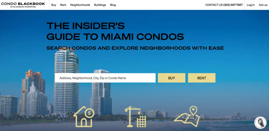
CondoBlackBook, a real estate company based in Miami, Florida, also makes it easy to take the next step on their homepage. As you can see above, a website visitor simply needs to plug in their location and whether they want to buy or rent. Then, they’ll be shown a variety of condos in their area. The search tool doesn’t require a lot of effort to use, making it a really effective element for a homepage!
On your website, consider using a sophisticated search tool, as CondoBlackBook has, in order to get a website visitor to take the next step with your business. Doing this will encourage people to learn more about what you can offer them, making it more likely that they’ll spend money with you down the road.
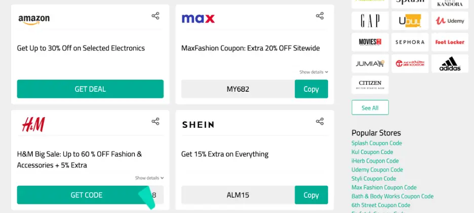
Almowafir Coupons, a free online coupon platform, makes it easy for users to take the next step on their homepage, as well. If you scroll down, you’ll see dozens of coupons for various websites, including Amazon and H&M. Then, the user simply has to copy and paste their coupon code. It’s a simple system that makes it very easy for visitors to get started!
On your homepage, consider highlighting some of your top products or services similar to the way Almowafir has. Doing this will show visitors that you have a lot of quality products or services, making it more likely that they’ll stick around to spend money with you.
Use homepage imagery that shows your business in the best light
Strong visuals are important for grabbing people’s attention and showing them what your business is all about!
There are a lot of different ways that you can engage your website visitors on your homepage using imagery. You can show off images of your team or your ideal customers to put a face to your business, show people the behind-the-scenes of your office, or showcase your brand’s personality.
Let’s take a look at an example of a business that uses imagery well on their homepage for inspiration.
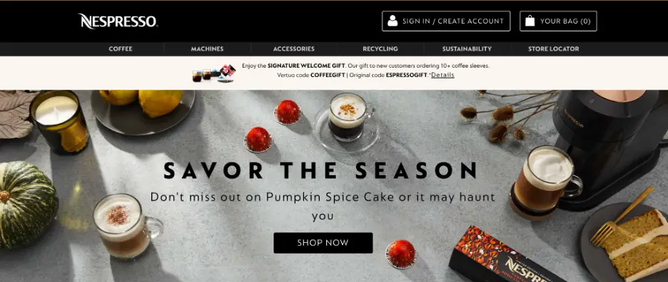
Nespresso, a retailer of coffee and espresso machines, has very effective imagery on their homepage. As you can see above, the picture features various fall elements, as well as different coffee drinks. This image and the seasonal details get people thinking about the different fall coffee drinks they could create. It’s very effective imagery that gets the website visitor excited to use a Nespresso machine.
On your homepage, get people excited about your products using imagery. Doing this will help people imagine themselves using your products or services, making it more likely that they’ll spend money with you.
Target the most appropriate keywords with your homepage copy
Keywords are phrases people type into search engines in order to find the information they’re looking for. Targeting the right keywords in your copy is an extremely important part of creating an effective homepage — it will help you boost your search engine optimization, or SEO, and rise through the search engine results pages for queries relevant to your business. This will help you attract website visitors that are more likely to make a purchase with you.
To conduct keyword research, start by coming up with a list of words and phrases related to your business. Then, head to a tool like Google Keyword Planner and plug these words into the tool. Google will then provide you with a list of keywords that people are searching for on these topics, with their competitiveness, or how hard they are to rank for, and their average monthly search volumes. When selecting keywords to target on your homepage, try to find the right balance between these metrics. You want to reach as many people as you can but, if you choose keywords that are too competitive, you risk not ranking at all.
Keep in mind that, when targeting keywords on your homepage, you want to choose those that you haven’t already targeted on other pages of your website. If you have multiple pages that are trying to rank for the same phrases, you risk hurting your own chances of ranking on the SERPs at all. This is called keyword cannibalization, and it’s something you want to avoid, as it can confuse search engines and they may end up not ranking your site at all.
For your homepage copy, choose keywords that are very relevant to your business at a high level. Don’t try to rank for keywords that are specific to certain products or sections of your website — save those for the relevant category pages. Then, once you’ve chosen your keywords, weave them into your homepage copy naturally, in places like the titles and headers. This will give Google more context as to what your website is about and help ensure that you rank for the most relevant queries.
Need more help? Check out the keyword research services offered by Loganix. We can help you find the keywords that will get you more search traffic.
Don’t forget to highlight what makes you stand out
The main reason you want to give off a positive first impression of your business is that you want your website visitors to shop with you, rather than your competitors. So, on your homepage, you need to highlight what helps you to stand out from the crowd. Here are a few ways you can do just that:
- Highlight your unique selling points
- Show off what great results you’ve gotten for your past customers
- Use humor, creativity, and your brand voice in your copy or imagery
- Highlight the promotions you’re running
Use these strategies to prove to your homepage visitors that you’re worth spending money with! Now, let’s take a look at a few examples of businesses that use this tactic well for inspiration.
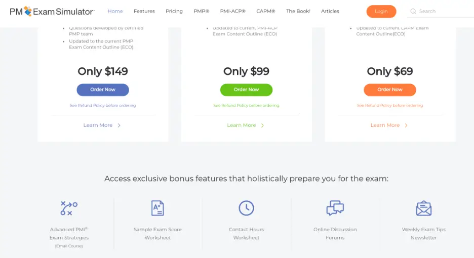
PM Exam Simulator, a provider of the PMP Practice Exam, highlights their unique selling points all across their homepage. The main thing that makes them stand out, according to their homepage, is that they are the only PM exam simulator with the largest number of realistic sample questions. Furthermore, across the homepage, PM Exam Simulator highlights what makes their programs so great, including sample score worksheets, weekly newsletters, online discussion forums and more. This is a great way for PM Exam Simulator to show what makes them better than their competitors!
On your website, be sure to highlight the best features of your products or services. If you can prove to a website visitor that you offer something better than your competitors, they’ll be more likely to spend money with you!
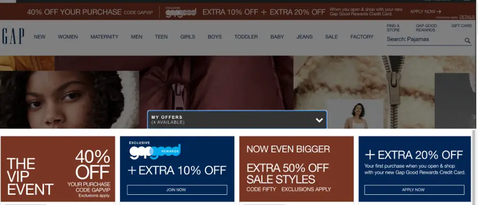
Finally, Gap, a men’s and women’s clothing retailer, also highlights what makes them better than their competitors on their homepage. As you can see above, one of the first things a website visitor sees is what offers they have access to and what sales are going on. This is a great way for Gap to convince website visitors to stay on the website and buy from them, since the visitor will know they’ll save money.
On your homepage, be sure to always highlight what sales or special deals you’re offering. Doing this will encourage visitors to stay and browse your website and increase the chances that they’ll make a purchase.
Summary
Your homepage is one of the most important parts of your website, so you need to work hard to get it right! In this article, we outlined different tips that will help you create an effective homepage for your website, including targeting the right keywords, using great imagery, showing off your social proof, and more.
Compare our examples to your own homepage and see what work needs to be done!

Adam Steele is the COO at Loganix, an SEO fulfillment partner for agencies and marketers. We build easy-to-use SEO services that help businesses scale. If you liked this article, please check out our SEO guides and templates on the Loganix blog.


[url=http://finasteride.cfd/]5mg propecia for sale[/url]
[url=https://zithromaxazithromycin.quest/]azithromycin 500 mg order online[/url]
Heya i’m for the first time here. I found this board and I in finding It really useful & it helped me out much.
I’m hoping to give one thing back and help others such as you aided me. http://Www.Fantasyroleplay.co/wiki/index.php/User:CierraPocock
Heya i’m for the first time here. I found this board
and I in finding It really useful & it helped me out much.
I’m hoping to give one thing back and help others such as you aided me. http://Www.Fantasyroleplay.co/wiki/index.php/User:CierraPocock
[url=https://zithromaxazithromycin.quest/]where can you get azithromycin over the counter[/url]