


Service pages are one of the most important parts of your business’s website. This is where your visitors go to learn about what you can do and how well you can do it. They have a huge impact on how many sales you make.
In this article, we’re going to outline how you can design service pages that sell.
Let’s get started.
Add strong calls-to-action and ensure they’re hard to miss
A lot of business owners make the mistake of not including a strong call to action, or CTA, on their service pages, but they can be very powerful for generating sales! A CTA is a word or phrase, often displayed on a button, that tells the viewer what to do next. Sometimes, people just need to be told what to do — here are a few different tips for incorporating a strong CTA into your service pages:
- Make sure it’s displayed on a bright and bold button
- Place it somewhere where it will be seen clearly
- Use a strong action verb
- Use words that provoke emotion or enthusiasm
Let’s take a look at a few service pages with strong CTAs for inspiration.
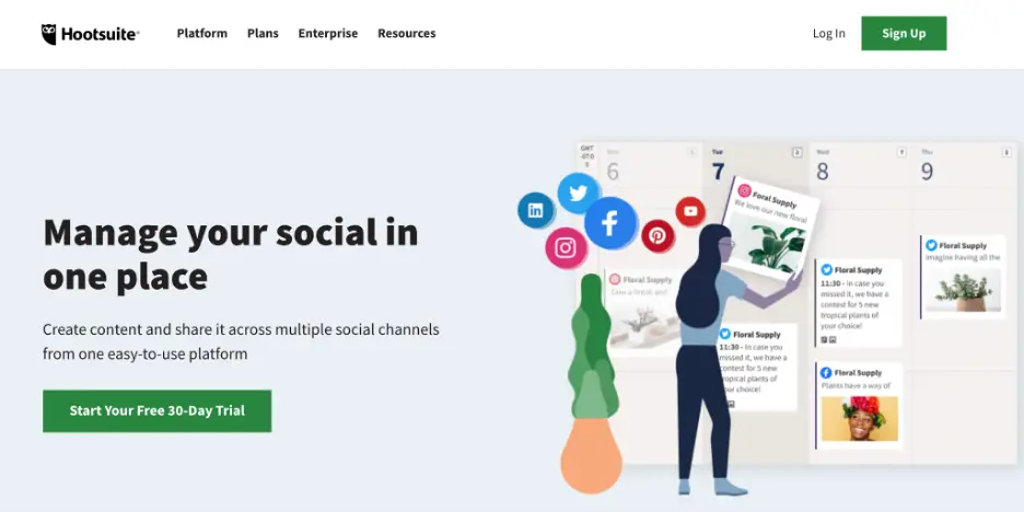
Hootsuite, a social media management platform, uses a similar strategy on their service page. In short, they tell the website visitor what they can get out of the platform with the call to action “Manage your social in one place” and encourage them to sign up for a trial.
It’s short but sweet and encourages more sales for their business. On your website, be sure that your supplementary copy supports your CTA and tells your website visitors why they should use your product or service.
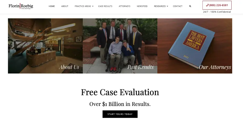
Florin Roebig, a trial attorney firm based out of Florida, has a series of excellent CTAs right on their homepage. If you scroll down, you’ll find a CTA that says “start yours today.” This encourages the website visitor to get a free case evaluation, which will potentially secure Florin Roebig a new client.
On your website, be sure that your CTAs are easy to find on the page so potential customers know where to click next. And make sure they tell people exactly what to do so there’s no confusion.
Always create space for proof of your abilities
Word-of-mouth recommendations are very powerful for showcasing your abilities and securing more sales. So, when you’re designing your service pages, it’s important that you dedicate a section to showing what past customers and clients think about you and your services. You can do this through reviews, testimonials, media mentions, or evidence of awards you’ve won, for instance.
For inspiration, let’s take a look at a few examples of service pages that show off their social proof well.
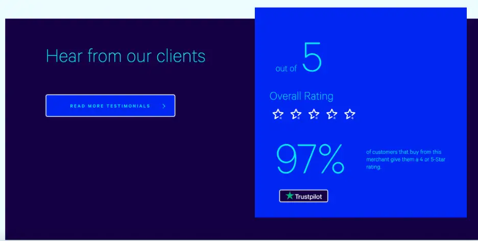
For instance, the digital marketing agency Loganix does a great job of this on their local citation building service page. If you scroll down, you’ll notice a “hear from our clients” section that shows the overall rating past and current clients have given Loganix. This is a great way to show prospective customers that you’re good at what you do — on your website, think about how you can incorporate star reviews or percentage ratings into your service pages to earn visitors’ trust.
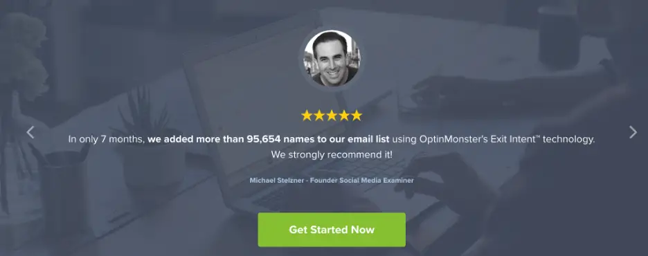
OptinMonster, an email marketing service provider, does something similar on their eCommerce service pages. If you scroll down, you can see a five-star rating and a short testimonial from a former client of OptinMonster.
This review shows that OptinMonster is good at what they do, and their past clients trust them to do a good job. Don’t be afraid to reach out to your past clients to ask them to leave feedback for your website. It’s a great way to build social proof!
Highlight the USPs and benefits above the fold
On your service pages, you want to highlight your unique selling propositions, or USPs, as soon as possible. So, you need to show what’s unique about your business and the benefits you offer above the fold. This will mean that these USPs and benefits are immediately visible without the user having to scroll down the page.
Be sure that you highlight your USPs and benefits before the price and the features — your website visitors want to know how your services can benefit them and what’s unique about your business before being given a hard sell.
Let’s look at an example of a business that highlights its USPs well and above the fold.
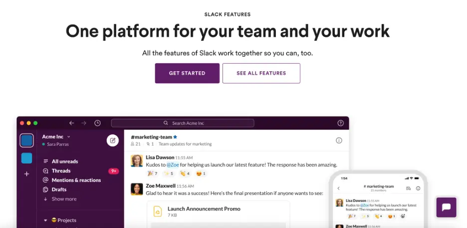
Slack, a business communication software program immediately highlights their USPs on their service page.
At the top of the page, Slack points out that their software lets teams connect and communicate through a single platform. Work, discussions and meetings can all be done through Slack. This is a great way for them to communicate their benefits and what’s unique about their product straight away.
On your website, be sure that the first thing your visitors see on your service page is how your service can truly benefit them.
Make it as easy as possible for people to take the next step
When people land on your service page, you want to make it as easy as possible for them to take the next step with your business — this will increase your chances of making a sale. You can make it easy for your website visitors to find more information or move forward in the buying journey by offering clear CTAs, providing sophisticated search features, or making it easy for them to get in touch with your customer service team.
Let’s look at a few examples of businesses that implement this strategy well.

Edith Cowan University, a higher education institution in Australia, makes it easy for website visitors to take the next steps on their Master of Cyber Security program page.
On the right side of the page, there’s a section where a website visitor can download a course guide to find more information about the program they are interested in — this can eventually lead customers to sign up for their classes. On your website, be sure to offer a place for customers to get supplementary information about your services, as this is a great way to help lead people through the buying process.
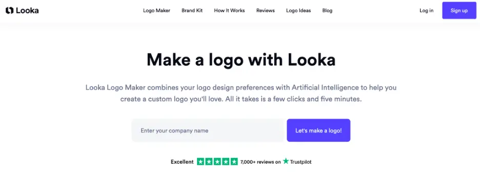
Looka, an online logo maker, does something similar on their service page. The supplementary copy here makes it clear to users what they need to do in order to take the next steps with Looka and create their logo.
Website visitors can simply plug in their company name and click “Let’s make a logo!” It’s a simple process that easily gets the visitor started without too many steps. On your website, consider using a similar strategy — try to quickly get your customers to try your services by asking them for minimal information. You can ask for any other details you need further down the line.
Only use imagery that shows your business in the best light
Strong visuals are important for grabbing people’s attention and showing them what your business is all about. You can use imagery to put a face to your business, show people what it’s like to work with you or showcase your brand’s personality.
The right graphic design or imagery on your service pages can help you make more sales! Let’s look at a few examples of businesses that use imagery well on their service pages.
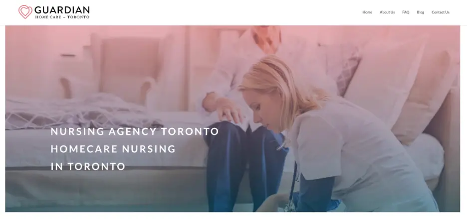
Guardian Home Care, a home care nursing agency in Toronto, uses emotive and comforting imagery on its service page, for example.
The image here shows a nurse assisting her elderly patient. Think about how important the right imagery is for health care services — putting your loved ones in the care of others can be difficult, but displaying imagery that shows nurses caring for patients reassures the website visitor. On your website, be sure to show your employees in a helpful, caring and positive light, no matter what industry you work in.
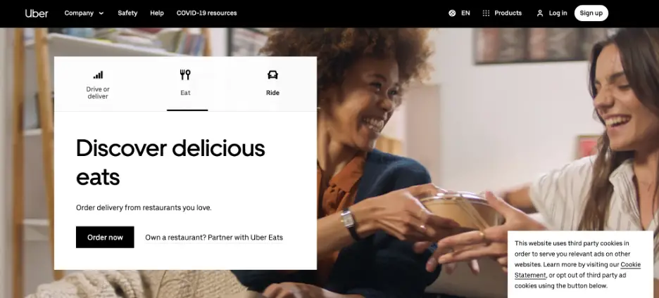
Uber, a food delivery and rideshare service company, does something similar on the web page for their UberEats service. The image shows two happy women eating takeout — this is something the website visitor could be experiencing if they choose to use UberEats! Showing happy customers like this is a great way to secure sales. On your service pages, be sure to show off images of customers enjoying your services, if possible — this will help you earn more conversions.
Ensure all of your service pages provide a positive experience
If your service pages don’t offer a positive user experience (UX), internet users won’t stick around long enough to make a purchase. You need to take the right steps to ensure that your website has a great experience or you’ll be less likely to make sales.
Here are a few tips for ensuring that your service pages offer a good experience:
- Ensure they have a fast loading speed (try to keep it under two seconds)
- Make sure they’re easy to read
- Provide your users with all of the necessary information
- Have a simple, yet effective design
All of these points are important for improving the user experience, which can help lead to more sales!
Summary
Your service pages are one of the most important parts of your website. In this article, we outlined how you can design yours to help you secure more sales, including by improving your UX, using the right imagery, and more.
Take a look at your service pages and see what work needs to be done. It can have a huge impact on your conversion rate.

Aaron Haynes is CEO and co-founder of Loganix. The company is an SEO fulfillment partner for digital marketing agencies and professionals, which provides the services businesses need to improve their online visibility and grow. If you liked this article, check out the Loganix blog, where you’ll find more SEO guides full of expert advice.