
You may not own a Thomas Kinkade, or know who he is, but you’ve seen his work before. He’s allegedly America’s most collected artist, with paintings in one out of every 20 U.S. homes. But Kinkade isn’t just on the wall. His work can be seen everywhere — on festive puzzles, holiday cookie tins, chocolate boxes, furniture — and generally depict the cheery, light-filled cottages nestled in rolling hills, characteristic of his art.
However, being popular doesn’t guarantee praise. For Kinkade’s entire career as an artist, critics have called his work “unpleasantly artificial,” the “epitome of mediocre art” and something “normal people should recoil from.”
A first glance reveals nothing inherently wrong with them; rather, they seem like the bland, inoffensive work you might find in three-star hotel lobbies or your grandmother’s dining room.
Judge for yourself:
https://www.instagram.com/p/CQXEBMIsFpm/?utm_source=ig_web_copy_link
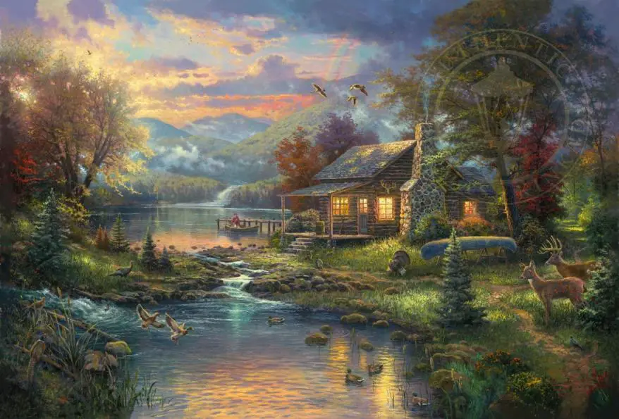
From an aesthetic point of view, Kinkade’s works may agitate because of their overly warm, fluorescent color palette. Kinkade sees the world as imperfect, needing just a touch of polishing by way of sometimes unnecessary additions. In fact, he calls himself a “Painter of Light” because of his distinctive and deliberate inclusions of warm-toned, dreamy light within each of his paintings.
Kinkade also used his Christianity to help explain his work; he likened the cheery glow ubiquitous in his works as the “light of Jesus.” On that note, bridges are a frequent subject, as are steps or grassy inclines leading through gated areas. Some of his paintings are visual depictions of Bible verses, such as “A Light in the Storm,” taken from John 8:12: “I am the light of the world.”
But serious Christian artists didn’t want him either — they called his predictable, saccharine work “opium for the semi-spiritual Masses.” In an article for Patheos, a leading Catholic commentary site, Thomas McDonald writes: “Kinkade-style light doesn’t show an affection for natural beauty — it shows his disdain for it. His light doesn’t reveal, it distorts. His paintings aren’t merely trivial, they’re a statement of contempt for the world. His vision of the world isn’t just tacky, it’s anti-Incarnational.”
As such, Kinkade’s depictions of nature’s majestic beauty would have been fine if he didn’t feel the need to add highlights of pastel colors or additional details like rainbows, beams of light from above or cheery lanterns lighting the way.
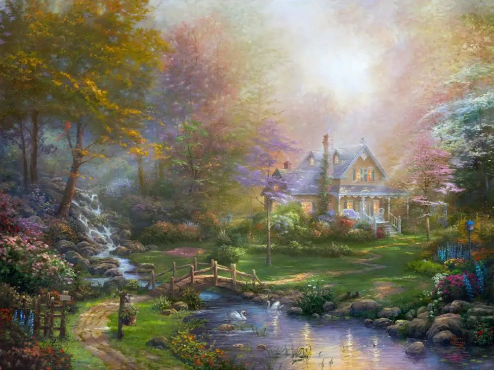
Take “Nature’s Paradise,” painted in 2009. It features a scene abundant with every conceivable symbol of nature and peace: birds, rainbows, deer, a cheery light-filled cottage, majestic mountains, a sunset, a calm stream, a lake, a man in a boat, etc.
The overarching intent of his works is to induce a viewer’s nostalgia for some real or perceived memory of a place in nature or in urban life. Kinkade’s own description of his works commonly refers to this idea — on his website’s description of his cottage works, it reads:
“Vibrant, safe and inviting — all are characteristics of idyllic family life and home. With an inspired use of architecture adorned with radiant light and positioned in pristine nature, Thomas Kinkade Studios cottages are a show window into the imagined life of each one’s occupants. Our mission is to move our collectors by the perfect harmony of home, nature and light.”
By attempting to romanticize and perfectly emulate each scene for eternity, Kinkade may lose what was special about natural scenes in the first place: its evanescence.
But Kinkade didn’t always paint this way; his earlier works from the early ‘80s and ‘90s were quite well balanced. In “Dawson (1984),” his subtle use of pale light to illuminate twilight doesn’t wash the details away, but rather draws our eyes to the grandeur of the background and the depiction of the Yukon town in the foreground. Visually, it’s similar to artists in the Hudson River School tradition.
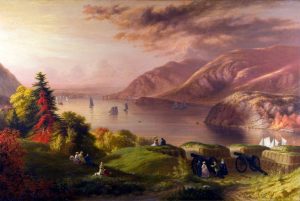
Can you guess which one is the Kinkade, and which one is the work of a critically acclaimed Hudson River School painter? (Answer: Left: “Dawson,” by Kinkade. Right: “View of the Hudson River,” by Robert Walter Weir).
You can see a gradual increase in the use of more of his characteristic “light” with a series of his 26 paintings in this article from Painted.com. His “San Francisco, Late Afternoon at Union Square (1990)” perfectly captures the glimmering city street shortly after it rained. Four years later, in 1994, his painting of “San Francisco, Market Street,” an almost identical location, is an idealized version of his previous painting. Over 20 American flags are immediately visible in the scene (though there’s likely more), in addition to the numerous plumes of smoke and puddles all around that serve no visual or narrative purpose.
The incidental magic of the piece is gone, replaced by artificial strokes of color and details added to intentionally invoke nostalgia. The first street scene was painted to capture a specific place, San Francisco, at a specific moment while the second scene was painted to capture a dream, for the moment on the consumer’s living room wall.
By the 2010s, Kinkade’s work could easily be likened to that of Lisa Frank, with its lurid colors and simplistic ideas. His second-to-last work, “Rosebud Cottage (2011),” is the pinnacle of “Kinkade.” Yet the colors and subject alone don’t explain the depth of people’s hatred for this particular artist; after all, plenty of people like the paintings of American naturalists such as Frederic Edwin Church or the domestic scenes painted by Normal Rockwell, both of which use similar concepts and variants of the color palette used in Kinkades.
Neither does it explain the depth of disregard for Kinkade by almost every major art critic, curator and museum, despite his mass appeal. His work has never been unironically featured in museums by itself, unadorned of justification, except for exhibits centered around “kitsch” as a cultural phenomenon — “kitsch” being a German word that means objects or art that are considered to be in poor taste, such as collectible Disney figurines, snow globes or stylized mugs.
So perhaps the distaste stems from its mass-produced quality, the same quality that allowed Kinkade to dominate the living rooms of America through relative affordability and accessibility — you could purchase “originals” from strip malls and furniture stores. But those originals were really just a pre-printed base with a few dabs of paint on it for posterity’s sake, made not by the man himself, but by his studio assistants.
Laura Miller, in an article for Salon, explained Kinkade’s production method as, “a semi-industrial process in which low-level apprentices embellish a prefab base provided by Kinkade.” Kinkade designed and painted all his works, but the ones available to purchase and most likely hanging up in your doctor’s office were printed à la factory line and touched up with manual brush strokes from an assistant.
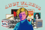
Yet artists such as Andy Warhol and Jeff Koons used the exact same method, and they are famously celebrated for their conception of works that deal explicitly with mass-produced, materialistic art. One only needs to think of Warhol’s Campbell Soup prints or Koons’ Balloon Dogs or his Giant Pile of Playdoh to see the contemporary hype for commodified art.
Or, if you go back even further, Marcel Duchamp, whose works are in the illustrious Tate Museum, the Met and MoMa, delighted the art world with his literal installation of a urinal. Duchamp, the cheeky cad, called it a “readymade,” an ordinary manufactured object designated by the artist as a work of art. “Readymades” are now frequent in modern art: the banana duct-taped to a wall fetching $120,000, a rumpled bed and even a pile of candy in a corner.
If Kinkade’s detractors are offended by his mastery of the market, his understanding of how to sell his work and the commodification of his art, then those same detractors should also denigrate the likes of Koons, Warhol, Duchamp and — quite frankly — most modern abstract artists today.
So what’s really wrong with it? Maybe because of its divisive nature, people are pressured to take a stance. When art critics and journalists trash the work, sticking out by not also trashing it in turn may mark you as the tasteless, uncultured swine of the masses. Or you might go against the grain, and try to find some hidden, special meaning to be part of the “select few” who “truly understand.” With Kinkade’s work, there’s no neutral boundary — you have to choose to love it or hate it.
A 2013 study in the British Journal of Aesthetics set up an experiment where they showed participants examples of “good” and “bad” art, with the “bad” being Kinkade, of course, and the “good” being John Everett Millais, a 19th-century Pre-Raphaelite (arguably proto-Kinkade, as his work featured analogous landscapes and artistic intentions). Here’s one of Millais’ works:
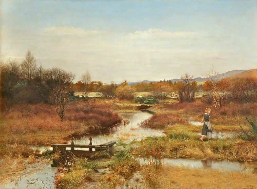
At first, there was no perceptible difference between the Millais and the Kinkade in participant responses. Over the course of several weeks, and repeated exposures, participants began to rate the Kinkade painting worse and worse, while the Millais paintings continued to receive roughly the same score.
The researchers hypothesized that the Kinkade garnered deeper hatred due to the intrinsic low artistic value of the works. Likening it to drinking bad ale, people who “tasted” the poorer version at first might not see all that is wrong with it, but after a few jugs of the stuff, they would be able to understand how terrible it truly was. Meskin, the principal researcher for the study, concluded: “Initial exposure to the Kinkades might not have enabled participants to see how garish the colors are and how hackneyed the imagery is.”
So, in sum: Kinkade is unwanted by the high art world because his paintings, though technically skilled, are conventional, lack depth of meaning, or use techniques, composition and content that has already been explored in the art world.
However, to his millions of buyers, Kinkade is the art they want hanging in their entryways. At his height, in 2001, Kinkade generated $130 million in sales. In a “60 Minutes” documentary by CBS News in 2001, Kinkade explained, “There’s been million-seller books and million-seller CDs. But there hasn’t been, until now, million-seller art. We have found a way to bring to millions of people an art that they can understand.”
Kinkade sold his paintings of cottages, lighthouses, gardens, gazebos and gates by the millions through a national network of Thomas Kinkade galleries, owned by his company. Part of its success was its calculated business model: selling as much as it could, in any way that it could. From holiday cards to mugs, it did it all. It even had a partnership with La-Z-Boy, selling upholstered armchairs with the light-suffused illustrations.
At its peak (between 1995 and 2005) there were 350 Kinkade franchises across the U.S. in roadside malls, shopping centers and furniture stores. “What’s compelling about this brand is, over the course of time, about 25 million people have purchased a Kinkade product,” according to former company COO Frank Turrell in an interview with NPR in 2010.
His paintings may be unoriginal, hackneyed and over-commodified, but the same could not be said of his downfall and death. In the years prior to his death in 2012 at the age of 54, Kinkade’s business plummeted into allegations of malpractice and eventual bankruptcy, and he endured a marital separation and spiraling alcoholism. Kinkade’s behavior became erratic and downright odd: He engaged in what he termed “ritual territory marking” at a California Disneyland hotel, urinating on a Winnie the Pooh figure. After his death from an accidental overdose of Valium and alcohol, obituaries were carefully neutral and oddly short for an artist as well-known as Kinkade.
His last work, painted in 2012, may be an unintentional expression of his artistic career throughout the years. Titled “Away From It All,” it’s an uncharacteristic departure from his hyper-bright portfolio. The colors are more muted. “Cheery” is no longer the undeniable emotion; rather, it’s the thoughtful silence of mountains — a little bit gloomy, a little bit alone, isolated by mountains. Kinkade himself grew up with the majestic view of the mighty Sierra Nevada mountain range, explaining to his viewers the need to “center themselves in the comforting retreat, away from it all.”
While Kinkade’s work may be trite or pleasing depending on who you ask, it’s abundantly clear that his palpable popularity tells us something about the nostalgia that pervades the consciousness of American living, a return to the safe glow of some imagined past.
In the words of Thomas Kinkade himself, “The No. 1 quote critics give me is, ‘Thom, your work is irrelevant.’ Now, that’s a fascinating, fascinating comment. Yes, irrelevant to the little subculture, this microculture, of modern art. But here’s the point: My art is relevant because it’s relevant to 10 million people. That makes me the most relevant artist in this culture.”