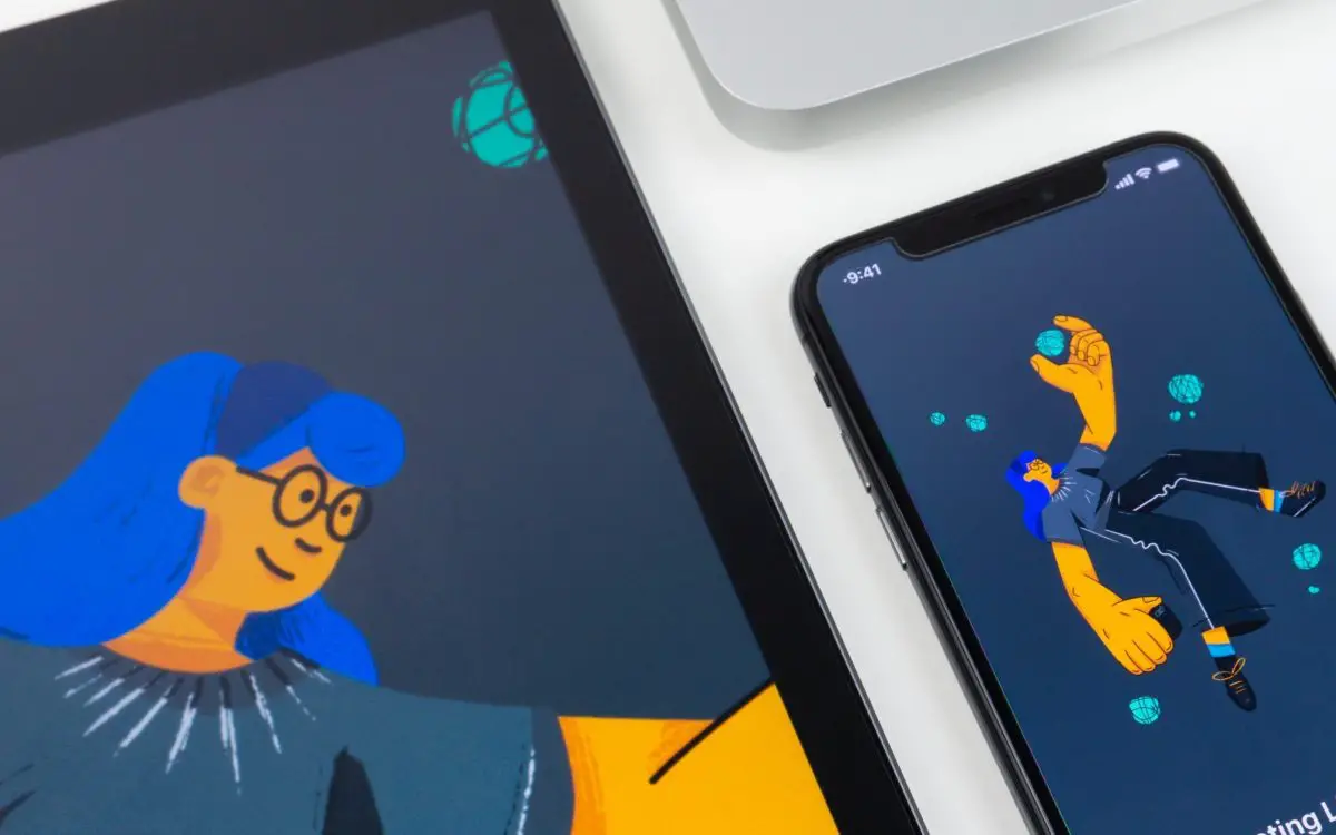

“The Earth without ‘art’ is just eh,” Demetri Martin once wisely stated. But, what happens when the art itself becomes just eh? The now generic, ignorantly sanguine advertisements created in the “Corporate Memphis” design style are loved by big tech companies and yuppie startups — and hated by the general public. The style is everywhere, characterized by its flat minimalism that intersperses cheery colors with disproportionate characters. Corporate Memphis has the subtle spunk that separates it from generic stock-vectors, yet the safeness of annoyingly peppy characters that possess non-human skin colors.
YouTube and the dating app Hinge are just a few of the companies that use this style. It’s on highway billboards and in subway stations. Wherever one turns, bendy, oversized limbs can be seen bounding across an advertisement. Perhaps it’s a chartreuse-colored, dot-eyed businesswoman whose huge limbs are in mid-motion, with a computer in hand. Or, maybe it’s a quirky bearded man, his lumberjack-chic garb swaying as he walks his cartoonishly-tiny magenta dog. No matter what the subject is, the work always seems to look the same. Following the style’s formula is immensely easy and requires little innovation on the graphic designer’s end.
People on the internet have been noticing this design trend and bashing it. Twitter user @technollama passionately wrote, “I didn’t know this horrible design trend had a name: Corporate Memphis. I hate it, yet apparently it’s very popular.”
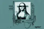
With the emergence of criticism came an abundance of internet memes mocking the mindless bubbliness of the style. One of the wittiest is a spoof of the famously horrifying 1800s Francesco de Goya painting, “Saturn Devouring His Son.” In the piece, a crazed, unkempt man holds the body of a baby, one of its arms in his mouth. The Big Tech parody copies the content, but the violent, bloody brushstrokes of Goya become minimalist, geometric shapes and the ominous color palette is replaced with pastels.
One senses the unnerving nature of the subject matter, but all of the fear, the innate human discomfort, is replaced by something apathetic and sanitary. It can be argued that the seemingly optimistic and energized nature of Corporate Memphis is simply its style. But, when it conceals a more disturbing underbelly, one must question its authenticity.
It’s understandable, beyond aesthetics, why the style has been met with such acrimony. On the surface, the style seems unproblematic because the characters are human enough to be recognizable but are utopian enough to possess an indistinct identity. In the world of Corporate Memphis, there are no racial divisions, just non-human colors, allowing companies to dodge lack-of-diversity claims. Characters are only depicted as feeling energetic merriment, as this Big Tech style seemingly has no room for melancholy.
But, maybe this cheeriness is exactly why people get so irked by the Corporate Memphis design. A company might use the cartoonish, childlike innocence of these illustrations to deceive consumers. The style can present a false sense of comfort, people agreeing to unsavory privacy policies or subscription contracts because of the subliminal cheeriness suggested by the illustrations.
Facebook, for instance, used generically positive illustrations amid the infamous Cambridge Analytica scandal, in which the personal data of millions was allegedly collected for political motives. As designer David Rudnick stated in an interview for Wired, Corporate Memphis “depicts a world whose problems are already solved, built out of complementary components” — however, “It’s a deliberate oversimplification.”
But Corporate Memphis didn’t just simply appear out of nowhere. Some speculate it may be connected to the 1980s Italian architecture collective named The Memphis Group. This Italian movement also used flatness, bold color and stark geometry in its designs. Others think the style may have evolved from BUCK, a design company that created the very similar style “Alegria” for Facebook’s visuals. Whatever the case may be, Corporate Memphis has evolved alongside the design mentality of large capitalist businesses that continuously simplify, flatten and streamline.
Many millennials and Generation Z reminisce about the old days when the original YouTube symbol, a clunky mid-century style television, was replaced with a simple play button, or the photo button changed from an image of a sunflower to a minimalist rendering of a blossom. The 2013 iOS shift from skeuomorphism — making a digital symbol resemble its real-life, three-dimensional counterpart — to flat minimalism, is the exact bandwagon Corporate Memphis jumped on.
The initial intent to simplify designs required a level of personal innovation. However, part of Corporate Memphis’ current problem is the sheer passivity that’s associated with corporations. The company Blush, for instance, is a Corporate Memphis-haters nightmare. Its mix-and-match illustration library allows users to create their own designs in that style. Not only does this actively take away jobs from talented illustrators, but it also implies that the act of illustrating is akin to dressing a paper doll — so simple that anyone can do it.
This isn’t to say that Corporate Memphis artists can’t be talented, because the active intent of creating from one’s own imagination is very different than simply conforming to a norm. However, the expectation that hired illustrators’ art will be in Corporate Memphis is hindering the possibilities for unique artistic innovation.
One can look at the zany, fabulously scribbled illustrations of the legendary George Booth in comparison to Corporate Memphis. If The New Yorker, one of his main haunts, had set strict guidelines for his work, readers across the world may have never been gifted with his artistic genius. It makes you wonder how many other George Booths may be out there who’ve been asked to push aside their unique style in exchange for Corporate Memphis.
The Corporate Memphis style is perhaps a reflection of American corporate culture at large — prioritizing competition over creativity, and conformity over capability. One can look to the insight of James Baldwin, who stated, “Artists are here to disturb the peace.” If cookie-cutter art is peace, maybe it’s time to start a rebellion.