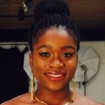
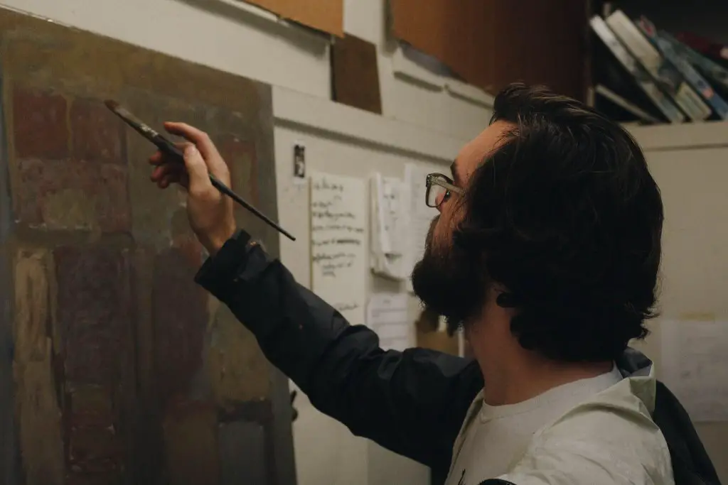
Whitson Ramsey, a visual artist and student at the University of Southern Mississippi, will be the first person to tell you that contrast, especially in colors, is a fickle thing, even moreso when its use is becoming your hallmark.
By nature, the concept is a product of restraint, as it can only exist in opposition, as precise counterpoint. A profusion, or an absence, of color can kill it. So though it might seem counter-intuitive, stark, truly effective contrast comes only as the result of meticulous balance.
Ramsey, a native of Hattiesburg, Mississippi, creates in the interstice where such contrast lives. He works primarily in three mediums: drawing, painting and sculpture.
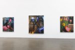
His drawings, which are all monochrome, balance white and black, color and darkness; his paintings, almost Munchian in their swirling, melting colors, have won a number of awards, including Best in Show at the 44th Annual Bi-State Art Competition at the Meridian Museum of Art; and his sculpture, which, in a masterwork of juxtaposition, features soft, rounded blooms of steel, concrete and wood.
I was able to speak with the artist about his work, philosophy and future in the field.
Maahfio Otchere: Your drawings are almost all monochromatic. Why do you choose to use only black and white?
Whitson Ramsey: I think that when it comes to drawing, you can view it in two separate ways: as a finished product or as a preparation for paintings, and I use both methods. When it comes to working on drawings as a means to simply make a drawing, I like to let it stand for itself. Using color would add more, but also take away from the form. I like to use drawing as a way to focus on shape.
MO: A lot of your figures have similar faces to the one in “Back to the Lake,” which won first place in drawing at the 2017 USM Student Show. Why use similar physiognamies?
WR: I always draw from live models, but I have never been one to think of the drawing process as representational. I don’t think there are real, nameable features about my work that call for some sort of individuality.
If I draw from someone, I am not necessarily trying to draw that person; I’m only using them as a point of reference. I never thought of putting identifiable factors or personality into my figures because that’s not what I am trying to make my drawings about. They’re more about getting the figure established in some sort of environment and then making it a part of that environment.
MO: Just as your drawings share a similar monochromatic aesthetic, most of your paintings feature muted colors. Do you think the softer tones influence the way people see your works?
WR: After studying the imagery of color, I found that using muted colors served as a way to make small amounts of brighter colors pop even more. So, I use the muted colors to establish a unifying color key, where the duller grays allow for the brighter colors to show more.
I really think I am rather conservative when it comes to using color, which I think comes from me not wanting to overuse brighter colors unnecessarily. I want to make a visual point when I use a highly saturated color because I think that there is a reaction to its use. As a result, having such contrasting colors next to one another creates an almost conflicting emotion within the viewer.
MO: Your painting “The Pink Man” won Best of Show at the 44th Annual Bi-State Competition at the Meridian Museum of Art in Meridian, Mississippi. What were you trying to do with that work, and do you think you succeeded?
WR: That painting was definitely a trial-and-error process of using what I had learned from earlier paintings, but in a more abstract way. I remember the painting being more about placing and laying colors and shapes without identifying an area as a feature.
I moved the shapes and colors so much that the work ended up being a mess. But from this I discovered the figure inside of it and saw different things that weren’t there before. I also had never painted in mostly pink, so I thought that would be interesting.
MO: In paintings such as “The Pink Man” and others, the images seem to blend together. Why avoid fixed lines?
WR: Similar to my use of colors, I think that edge quality and lines have more distinction if I use loose, soft areas to show hard edges in a more impactful way. Whenever I then decide to put in a hard edge, it becomes a contrasting feature, rather than a unifying factor. By using soft edges, you can get away with getting more colors into the painting while maintaining their natural fluidity.
MO: Considering your predilection for fluidity and boundarylessness, your sculptures are incredibly rigid. Works such as “Steel and Stained Wood” and “Rusted Steel” are sharp departures from the softness of your paintings. Why delve into sculpture at all?
WR: As a medium, sculpture is definitely a branch-off of what I had been doing at the time, but it was an opportunity to explore metal and wood. With my sculptures, I have always gone a non-objective route and chose unnatural forms to invade the environment we inhabit.
While I had never done non-objective painting and drawings, when it came to sculpture, the field offered a chance for me to explore a new realm, even if it was not related to to my two-dimensional work.
MO: In your sculptures, there is often a thick, circular or crescent-shaped piece attached to an arched base. Is the repetition of that theme significant?
WR: Sculptures are a more industrial way of art because of the machinery and metal used to create the piece. In the structures you’re referring to, I think you get a more organic shape that contrasts against the inorganic materials.
Since the materials are very processed, playing that aspect against the free organic shapes helps define the nature of the work.

