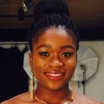

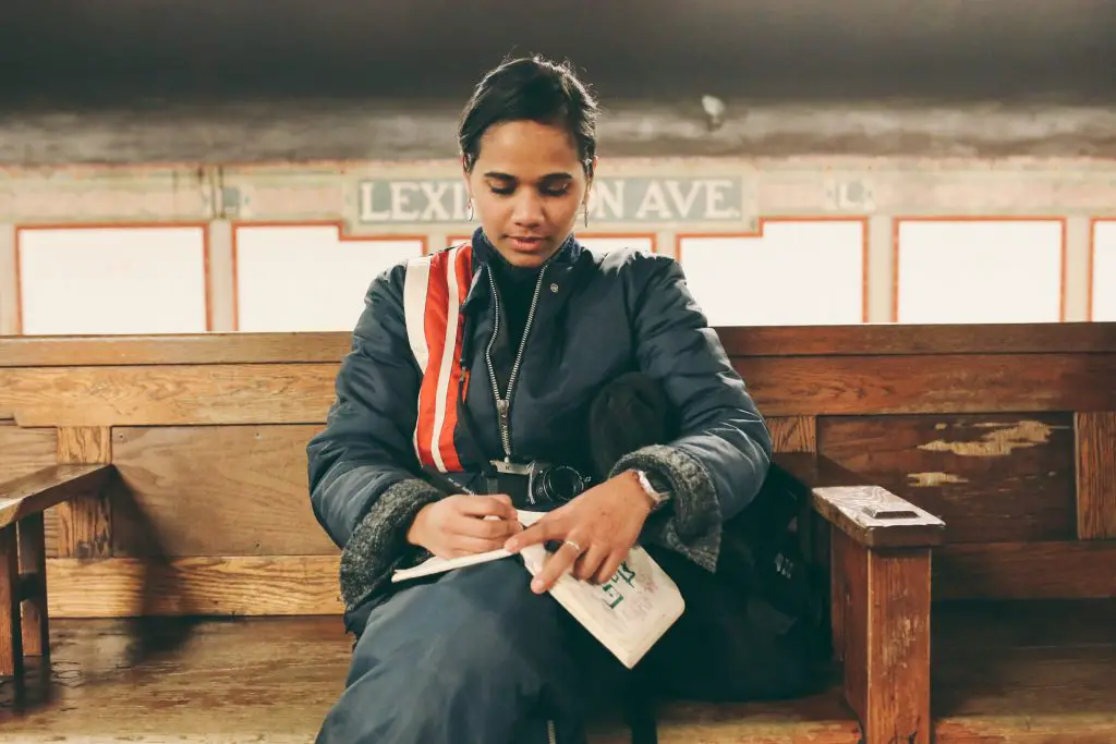
Tasnima Tanzim, a senior at the Rhode Island School of Design, enjoys leaning into discomfort. In fall 2016, she exhibited an installation piece called “Painting in Darklight,” in which she created visual images using glow-in-the-dark paint in a blacklit room. The work, which explored the idea of removing the self from the process of creation and focusing only on the creation, reflects the intense scrutiny she brings to the process of art-making itself. As a graphic designer, painter and photographer, Tanzim has brought that same level of scrutiny to every medium she’s used, which has led to a diverse portfolio united more by an ethos than a distinctive style.
Tanzim is also the founder of Being Bengali, an organization that highlights the diaspora of Bengali creatives. As an immigrant from Bangladesh herself, her history has influenced her creative process, particularly in her passion for warm, bold colors and typefaces; several of her designs explore the Bengali language, which she speaks, along with English and Hindi. Tanzim has been the recipient of numerous awards, including the 2015 Hearst Magazines Scholarship Award, 2017 Graphic Communications Scholarship Foundation Award and the 2016 Ron West Award for Visual & Academic Achievement. I had the chance to ask her about her work, and the nuances that she shows within them.
Maahfio Otchere: It seems like you really love color, especially bright colors. Why?
Tsanima Tanzim: My sense of color is completely informed by my culture. Growing up in Bangladesh, I was always surrounded by the warmest, brightest colors, so when I moved to New York at age 10, I sought out warm and bright colors for comfort. As I got older, the colors eventually bled into my work. I used the color as a way to aid in helping to tell stories and communicate. I feel that color gives the concept a voice.
MO: As a multidisciplinary artist, what unites your work?
TT: I believe design is fluid. So, as a designer, sometimes I’m called to be a community organizer, sometimes a photographer and sometimes an illustrator. I’m really just trying to communicate, so I use different mediums. I let the challenge decide what medium should be used.
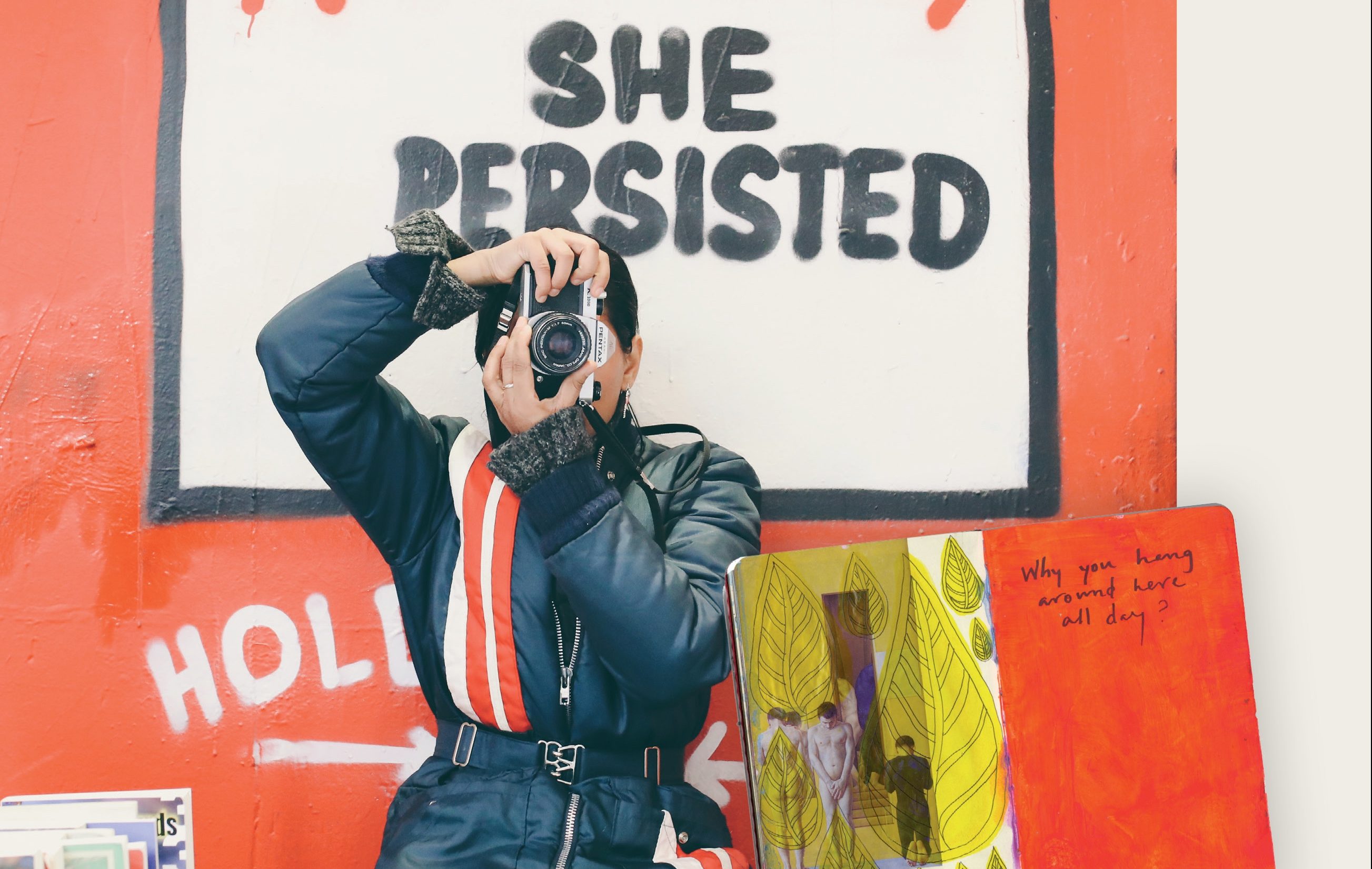
MO: Though your visual arts are amazing, I found myself surprised at how arresting some of your photography could be. Is the medium a new undertaking for you?
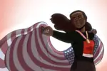
TT: Photography has been my hobby for quite some time now. I very much like to document my travels and moments with the people I love, but only recently have I started taking photographs with a true concept. In my photographs, I find myself trying to capture moments of pause or silence that trigger reflection.
That being said,I have done commissions for friends before and tried a bit of product photography. But nothing brings me more joy than loading a new roll of 35mm film into my analogue. This summer, while traveling through Europe, I challenged myself to finish at least one roll of film per city. It was an assignment I gave to myself, but it ended up being one of the most joyous experiences.
MO: Why did you choose to paint in blacklight?
TT: Honestly blacklight was just a very fun, interesting medium, so I wanted to find a way to explore it. However, this year I was taking an installation class, and in it, I went back to the blacklight-painting concept and tried to find what things I could push more.
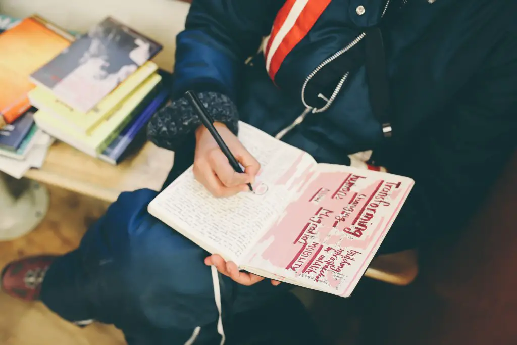
The most recent installation was inspired by my sketchbook, which tends to be my safe space. It’s where I can let go of emotions and really dig down and explore them, through color, words and texture. So, I created a space with blacklight again, using different elements from sketchbook, and tried to make a fun, happy and comfortable space that others could also enjoy.
I also think this piece helped me explore how important my personal practices are to my work in design. It helped me understand that these worlds didn’t need to be separate, but they could weave together.
MO: In your sketchbooks, which are filled with an enormous number of images, quotes and collages, a drawing of a woman with purple skin and green hair stood out to me; it’s set next to what looks like a poem. Do you remember what inspired that one?
TT: I think I found a photograph of a woman I found very beautiful and wanted to sketch her. I had drawn her in just pen initially, and then I added colors to her weeks later. I think I had markers that had different fruity smells, so when I smelled the purple and green they smelled like they fit together, so I shared them with this unknown woman I found a photograph of.
The poem is actually a LCD Soundsystem song called “All My Friends.” At the time, I’m pretty sure I was struggling with losing someone close to me, so the song was a sort of summary of our time together. I was feeling bittersweet about the situation; sometimes I found my loss poetic, sometimes upsetting, and the song helped me feel both.