In early December, Pantone announced its annual “Color of the Year” for 2018. This coming year’s signature look consists of a deep, vibrant purple called Ultra Violet, according to the company known for creating a color space used around the world called Pantone Matching System. Pantone’s reach sweeps the globe, though its name is not necessarily “household.”
Ultra Violet will saturate homes, closets and trends in the coming months if Pantone’s color predictions are correct. The “Color of the Year,” an annual announcement that has been made by the company since 2000, is “a dramatically provocative and thoughtful purple shade,” and “communicates originality, ingenuity, and visionary thinking that points us toward the future,” as Pantone’s website nimbly points out.
Although the company is currently a prominent entity in industries such as fashion and home design, when it was established in 1963 by Lawrence Herbert, Pantone’s original mission was “identifying, matching and communicating colors” to solve issues within the graphic arts community. The corporation’s impact on color technology shows in its undeniable success across the globe. Today, Pantone is recognized as the leader in color systems, and since its founding, it has permeated the barriers to entry for most lines of business.
Pantone’s business model has expanded from a focus on color matching systems to the design, manufacture and sale of items that match their designated color schemes, as well as their specific “Color of the Year.” Pieces in their collections include clothing, home goods, paints, fabrics, makeup, shoes and jewelry, giving Pantone a reach that stretches across most industry lines. Consistent with its original graphic design goals, the company still offers color systems and its annual color pick as “Chip Drives,” allowing designers to digitally carry Pantone wherever they go.
The company’s influence on such a range of trades has lead businesses of all kinds to collaborate with Pantone on specific collections. Sephora, for example, began its partnership with Pantone in 2012, wherein the cosmetics chain incorporated the “Color of the Year,” Tangerine Tango, into a makeup collection. The brands have since continued their collaboration and produced an annual limited release makeup set under their coupled brand names, Sephora + Pantone Universe, entitled “The Color of the Year Collection.”
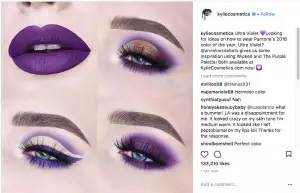
Pantone’s success in the beauty industry has not gone unnoticed. In fact, Kylie Cosmetics—an increasingly distinguished makeup brand created by reality star Kylie Jenner—recently posted an Instagram photo acknowledging Ultra Violet and simultaneously promoting the makeup brand’s own “Purple Palette.” Kylie Cosmetics’ post helps demonstrate the pervading mastery that Pantone exhibits, seeing as an almost brand new (albeit highly successful) cosmetics company seeks to associate its label with the global color icon.
Since the 2018 “Color of the Year” announcement early last month, the fashion industry has similarly clutched to the publicity created by Pantone. “Glamour” ranked Ultra Violet first on their list of “8 Fashion Trends to Get Excited About in 2018,” as though Pantone’s announcement did not suffice. In its “Style” section, “Us Weekly” elaborated on celebrities who “rocked Ultra Violet” before Pantone’s decision was made public, despite the fact that most of the photos in the article show celebrities in completely different shades of purple than Ultra Violet.
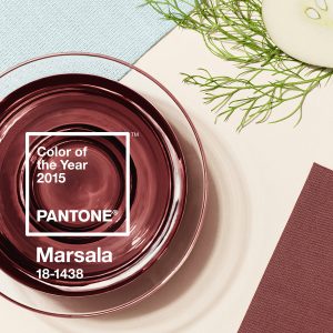
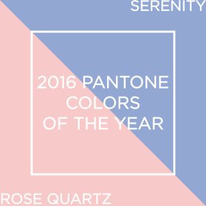
Even so, it’s needless to say how much sway Pantone has in certain industries. Even looking back on past colors — namely, 2015’s dusty, soft wine color, Marsala, or 2016’s color duo, Serenity blue and Rose Quartz — it’s obvious that the corporation produces fashion and beauty trends that last. How many wine colored lipsticks have you tried or seen friends try since 2015? What about the sudden resurgence of rose gold since last year? These color schemes are not random — each one has a Pantone “Chip Drive” stuck in its side.
Ultra Violet is no different than past “Colors of the Year” in terms of the impact it will likely have on marketing, especially because of its overall flattering nature. What is interesting about Pantone’s choice, though, is the way the company describes how and why they opted for the vibrant violet shade. Pantone explains that bright purples have “long been symbolic of counterculture, unconventionality and artistic brilliance.”
The company also mentions that the choice had musical influences, such as Jimi Hendrix, David Bowie and Prince, all of whom were icons of rejecting norms in one way or another. Each exhibited verifiable, irrefutable artistic brilliance, too. But what do these artists and their refusal to conform to societal expectations have to do with an annual color forecast?
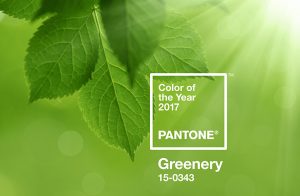
Pantone’s 2017 “Color of the Year” was Greenery, or “nature’s neutral,” as the company described it. Leatrice Eiseman, the Executive Director of the Pantone Color Institute — the group that chooses each year’s color — explained that Greenery provided a “reassurance we yearn for amid a tumultuous social and political environment.” Though the color does not denote explicit political opposition, Greenery represents a resistance to manmade turbulence — it is, after all, nature’s neutral, a fresh start.
This year’s color, Ultra Violet, conveys less connection with nature and more ties to action. Eiseman details the Color Institute’s choice, noting, “We are living in a time that requires inventiveness and imagination. It is this kind of creative inspiration that is indigenous to PANTONE 18-3838 Ultra Violet, a blue-based purple that takes our awareness and potential to a higher level.”
Ultra Violet is expected to elicit conscientiousness through its roots to counterculture and eccentricity. 2018’s color, though not an overt rejection of any particular societal norm, invites an ingenuity that might elicit change in one way or another. The striking, galactic purple refuses to adhere to confining boundaries, much like its parent, Pantone. It is also almost the exact opposite of Greenery on the color wheel. What didn’t work in 2017 — politically, personally, socially — must be reimagined and stronger this coming year. Nature’s neutral has met its match. Ultra Violet knows no limits, and its brilliance inspires an unusual confidence that can only help make 2018 a success. Let the cultural resolution begin.


