Design is such a basic part of life that people tend to forget how much goes on behind the scenes.
In Netflix’s new documentary series, “Abstract: The Art of Design,” former “Wired” Editor-in-Chief Scott Dadich takes an intimate look into the lives of the most prolific artists in the world. From illustrating covers for the “The New Yorker” to designing stages and sets for Kanye West and fashion shows, the variety will appeal to most any viewer. The first season covers the lives of six designers, showing their processes as well as the hurdles necessary for success in the creative world.
Each episode is meant to stand on its own and encompass the intent behind certain forms of creation. Dadich’s main goal was to film a documentary series that wasn’t stale and minimalist, but one that created a sense of what the future holds. Whether you just enjoy watching painting tutorials, or you’re a full-time artist, it’s exciting. So, if you’re suffering from a post-Bob Ross binge, “Abstract” can help you get back on your feet.
1. Not Your Average Documentary
The humanity behind each episode sets the show apart from other design documentaries that “look like a moving version of a coffee-table book.” With the help of some of the best documentary filmmakers and editors, “Abstract” creates an experience that enthralls as well as informs.
Through gorgeous cinematography, carefully edited interviews and shots of each artist’s daily life, the screen takes on a life of its own. Netflix is known for its high-level production quality, and “Abstract” is no exception to this trend. Each story feels different, which reflects the artist’s distinct experiences.

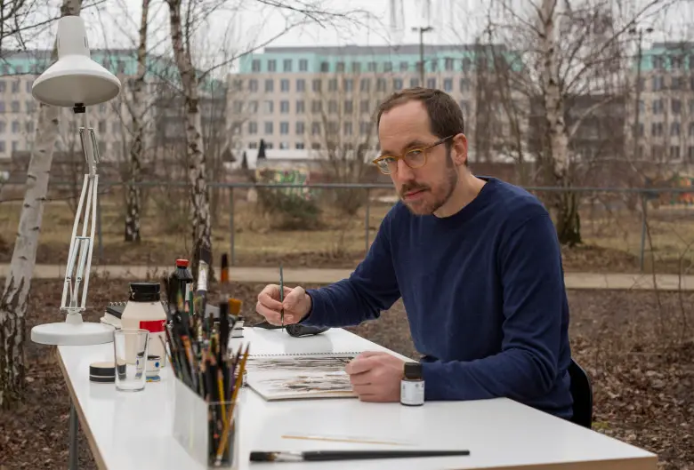
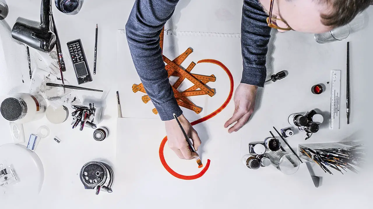
Christoph Niemann, a German illustrator, feels whimsical and modest. His work focuses on the art of abstraction, making a design as simple as possible without losing its meaning. The show tells his story through animated drawings, anecdotes from art school and candid moments from his everyday life.
On the other hand, Tinker Hatfield’s work and life feels more like a celebrity story. As a designer for Nike, Hatfield created the Air Jordan 3 through 15. Something as everyday as a shoe might slip your radar, but seeing Hatfield design a new shoe for each Air Jordan release makes the process more fascinating, even if you’ve never been an avid footwear fan.
2. Interesting Even for Non-Artists
As the warm, fuzzy feelings activated by the happy clouds and friendly trees in Bob Ross paintings have proven, one doesn’t need to be an artist to appreciate each brush stroke and splash of color. Design is more than creating a product. Shows like “How It’s Made” are interesting because they show the process from idea to finished product. You can take the most boring item on earth and make the its creation intriguing to watch.

Luckily, “Abstract” doesn’t walk you through the making of boat oars. Like the goods produced in factories, though, each artist’s approach is vastly different and equally absorbing. Architect Bjarke Ingels compares his process to the movie “Inception,” saying that architecture is like manipulating a dream world, but in the end, your dreams become reality. Looking at some of his work, like the 8 House in Denmark, a building shaped like a figure-8 from above, it’s easy to see the dream-like elements come to life.
Art that’s relevant to everyday life is much easier to appreciate when you don’t have a lot of imaginative experience under your belt. Everyone wears clothing, looks at advertisements, engages in entertainment and utilizes some form of transportation. None of that would exist if someone hadn’t thought it up and created it.
3. Inspiration Fuel
Maybe you actually are an artist. In this case, “Abstract” is a perfect way to kill a few hours while learning something new. Depending on what your preferred medium is, some episodes might be more helpful than others, but you can collect new ideas and techniques from other methods of creation. If you’re a painter always looking at other paintings and nothing else, your work might get a bit stale. “Abstract” provides a sampling in each episode, so viewers won’t be bored by a subject that isn’t as exciting to them.

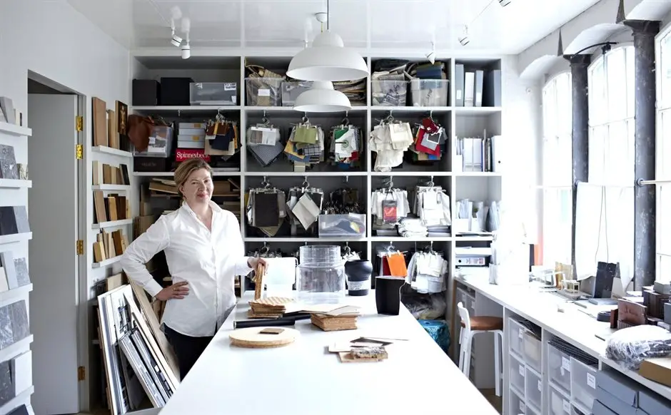
Artists are inspired by everything that generates a spark, whether it’s a song that clicks with you like no other or a cool-looking piece of furniture at Ikea. Interior designer Ilse Crawford uses her experience as a former magazine editor as inspiration when creating a room and all of its elements. She learned how to excite people through the pages of a magazine, and found it was similar to piecing together furniture to create a certain atmosphere. Anthropology and behavioral science also play a role in how she approaches design, because people act differently depending on the ambiance and function of a room.
“Abstract” is a great source of inspiration, but it may also serve as a starting point for your brain to sift through your individual muses. Seeing Crawford’s methods might trigger an epiphany when it comes to your own projects.
4. Diversity in People and Art
Not only does the series mix it up when it comes to forms of design, but it also showcases people from various backgrounds and locations. Automotive Designer Ralph Gilles, son of Haitian immigrants, recounts the uncertainty and guilt that came with telling his father he had dropped out of college after only five weeks, a decision young people still struggle with today.
Some of the diversity also comes from art subjects. Platon, a photographer from London, relies on the variety of people he shoots to create an impressive portfolio of assorted faces. He emphasizes that the connection he forges with the photo’s subject is the most important part of the process. The sentiment is fitting, seeing as the artist community relies on collaboration and bonding over new concepts and forms of innovation.


