Microsoft PowerPoint evokes a kind of nostalgia. It’s faintly reminiscent of childhood days when teachers thought it necessary to create slides in class and jeopardy games in PowerPoint with the enigmas that were action buttons.
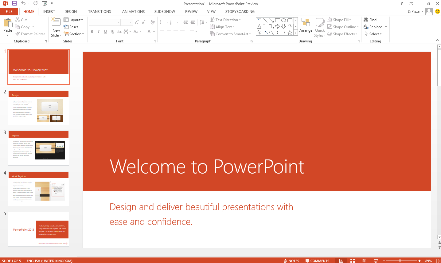
PowerPoint has evolved today with Microsoft’s business-targeted software package, Microsoft office, but it is still comprised of the same interface that most are accustomed to: A list of all of the slides to scroll through on the left side, a header bar with a myriad of tools, the same red logo, etc.
PowerPoint has dominated the presentation scene with its rather imposing presence. The iconic red seems to speak to its users with magnified effects of typical blaring red alerts. There are the (likely) eight tabs concentrated on the left side of the header bar of the interface, plus that lone share tab on the far right if you happen to have a more recent version, that represent a feeling of Zen and balance. Centering the tabs would be absolute blasphemy, contradicting the core philosophy of Microsoft as a whole. The upper left is where it’s at.
And in each justified left tab, from Home to Insert to Animations to Transitions, there are no less than 20 icons for each, demonstrating an impressive array of functionality that PowerPoint is so known for: Catering to the wide array of brutally intelligent people that pervade the world and dazzling them with the glamor of miniature icons with widely varying abilities. PowerPoint is the elitist that displays all its skills to the public—overwhelming, imposing and slightly a snob.

Google Slides, the new youngling (or perhaps not so young anymore), has made the craft of presentation-making possible in the browser. Convenient, and now the choice of mechanism for most “modernized” school students who need to work together on presentations, Google Slides is quite the conducive environment for collaboration, with strongly multi-threaded software that works much more smoothly than often sluggish counterparts.
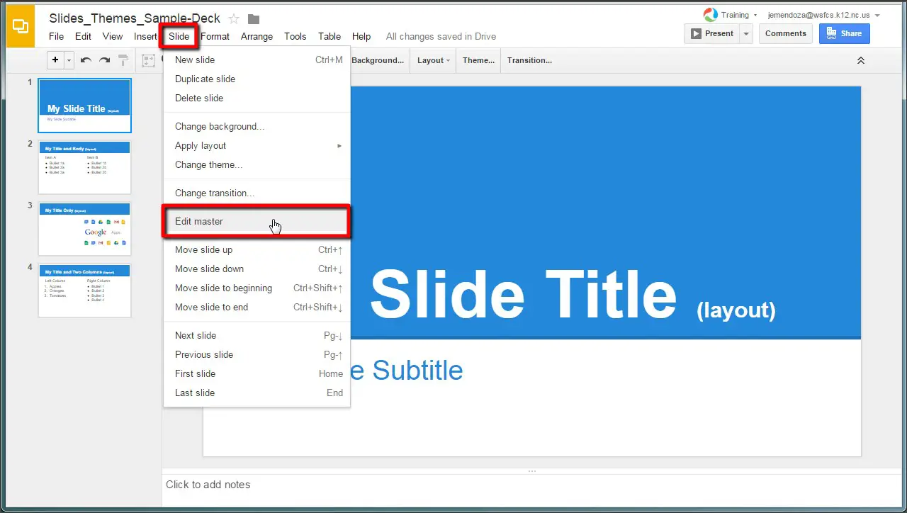
Like in PowerPoint, the upper left is where it’s at, the home to most of the core functions. The difference: Clicking these tabs does not, in fact, change the header bar, but reveals a long, sharp rectangular dropdown in all its unholy glory. The dropdown extends so far as to take up over 50 percent of the screen. The Format tab is particularly guilty. The options in each dropdown are nearly all text, a rather drab, colorless contrast to the very icon-based PowerPoint and soon-to-be-mentioned KeyNote.
Like its predecessors, Google Slides has the same core functions that one might expect from a presentation software. One might even call it a simplified version of PowerPoint. But it is not merely a simplified version. It is a physically greyed-out, soul-sucked version that functions only when WiFi decides to grace you with its overwhelming presence. Perhaps the only advantage to using this alternative is that it is made by Google and compatible with Google accounts and Google Drive, a cloud storage option that has more or less taken over the world (minus China).

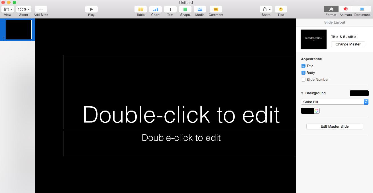
Finally, there is Keynote, the little known presentation software that comes with Macs. Apple engineers have put in much blood, sweat and tears to create this gem, where the header toolbar is, in fact, aligned center and bedazzled with colored icons that have text descriptions beneath just in case the user is visually oblivious.
At first glance, there are very few functions in this software constrained by the icons on the top bar. But click one and a world of opportunity is opened, waiting to revolutionize that particular slide that you hope will keep your audience awake. Keynote comes with a marvelous set of animations including “Anvil” which drops an object into the screen, creating smoke and dust upon impact.
Keynote also happens to be responsible for the attention-grabbing presentations that are displayed at Apple’s WWDC.
Keynote epitomizes the idea that users should not have to think. It assumes the worst of the user, that he or she is a blundering idiot and, as a result, is sleek and encapsulates functionality within simplicity. Adding and editing images are a result of dragging and simple force click.
The commenting system is a fascinating experience, consisting of sticky note-like squares of a shade of yellow not too far off from that of the sticky notes in Windows. The yellow squares pop up right above whatever text or image deemed worthy of a comment and leave long, yellow streaks to remind the world that there is something more to be seen than meets the eye. Which is normally always the case when it comes to Apple and its highly encapsulated workings.

If only collaboration would be just a bit smoother, intuitive and synchronous, Keynote would be crowned winner of all presentation software in existence. The unfortunate reality is that the in-browser version of Keynote resembles an underachieving sibling more than it does a suitable replacement for those without MacBooks. Many font styles are not maintained between Keynote presentation versions, and simultaneous work is more of a complex juggle of who-should-modify-what-at-which-point-in-time so that nothing breaks.
Ultimately, regardless of interface, it all boils down to what suits you.
If you own a PC, are highly technical and do not work at Apple, are any engineer except software, are old school, want the illusion of being productive, or have somewhat of an elitist attitude toward everything in this world, then Microsoft PowerPoint is the way to go.
If you do not believe in desktop applications, work at Google, have unwavering faith in the cloud, are fairly simplistic, need to preserve formatting and fonts regardless of the computer you are on, want the illusion of being collaborative, or are okay with a fairly colorless life full of obstructive dropdowns, use Google Slides.
If you work at Apple, are a diehard Mac fan, do not like to think too hard, want to interface with some beautiful user design, are okay with fonts not translating when exporting your slides, can overlook all of the shortcomings of iCloud and Keynote’s complicated relationship, or want the illusion of being innovative, you should give Keynote a chance.


